2024 ・ World Family English ・ Education
Renewal Disney World of English Responsive Website

Project Goal
To ensure users can effectively and conveniently use the DWE website, we provide a consistent UI/UX design. We aim to clearly communicate product features and benefits to encourage potential customers' participation. Additionally, we incorporate feedback to achieve continuous quality improvement.
Team
Alinta Cheng (PM)
Nari Kim (UX/UI Designer)
Chihwei Huang (UX/UI Designer)
Wanju Shen (UI Designer)
Reneta Chang (Developer)
Tools
Figma
Confluence
Jira
My Role
I conducted UX research for the Korean DWE (Disney World of English) website, including site analysis, global UX pattern comparison, IA design, and wireframing. Based on this, I proposed a main page design with UX writing guidelines, a color palette, and typography. While my design was not implemented, my research became the foundation for the product team to design the Korean DWE site and later influenced the localization of the Hong Kong and Taiwan DWE websites.


I analyzed the purpose of each page on the existing website, formulated hypotheses from the user’s perspective, identified issues, and derived solutions.

Users feel confused about the location and have difficulty comparing products when exploring products. It also needs to make it easier for users to recognize the value of the DWE brand. We should improve the user journey for easier navigation. Enhance the content of the products and add features to facilitate comparisons of key elements. Increase brand visibility.
Global UX Benchmarking
The Korean marketing team wanted to apply packages and programs in a specific way within the UX/UI. However, this approach had the potential to hinder the user experience. To ensure users could navigate and understand the content more intuitively, I benchmarked effective UX patterns from global markets (Taiwan, Hong Kong, Japan) and derived an optimal UX/UI strategy tailored for the Korean market.


Information Architecture Design
To improve the navigation structure of the existing website, I designed an optimal sitemap by referencing the UX patterns of global markets (Hong Kong, Taiwan, Japan) to balance the requirements of the Korean Marketing Team (KMT) with user experience. Additionally, I incorporated color bullets to clearly distinguish the improvement elements.

Wireframe Design
Based on the improved Information Architecture, I developed a wireframe to visualize the optimized user experience.

In the initial stage, I sketched Lo-Fi wireframes on paper to conceptualize the basic layout and flow. Then, based on these sketches, I created digital wireframes in Figma to refine detailed elements and enhance the UX/UI.

UX Writing Guide
I proposed an initial guide, considering that UX Writing is not just text but a crucial element in designing user experience.
Although it was not reflected in the final design, I established a strategy to help users understand information more easily and take action through effective UX Writing.

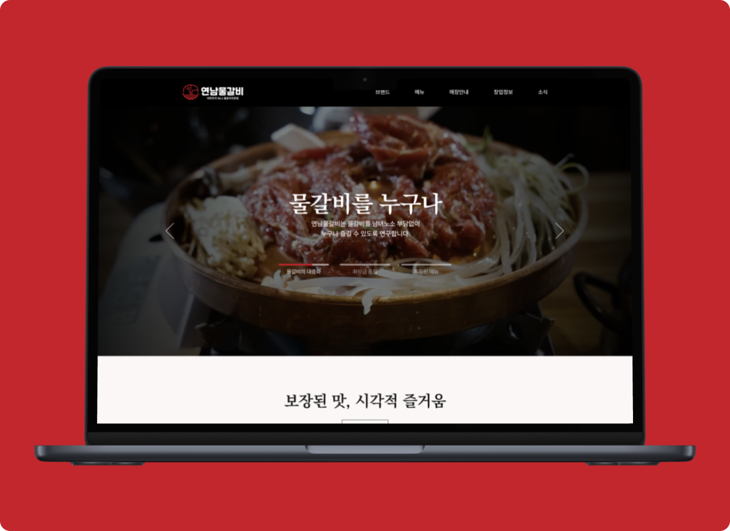
Design Proposal
In this project, I was responsible for UX/UI planning and directly proposed the main page design concept. Focusing on enhancing user navigation, I aimed to effectively convey the brand identity while designing an intuitive UI. I established a style guide by defining the color palette and typography. To increase visual engagement, I incorporated full-size banners, card-style UI, and interactive elements. Although the final design was executed by the Hong Kong UI designer with some modifications based on the marketing team’s requests, the initial concept was designed to provide an optimized user experience aligned with UX principles.


UX Strategy & Flow
I structured the information architecture to ensure users can naturally navigate the main page, considering the following flow.

Selected Works